
POWER BI Manual
During our Open Data Day event at the beginning of March, we demonstrated a number of easy-to-use tools that can enhance your everyday data use. In this series of blogs we share our learnings and provide short manuals that will help get you started with using each tool.
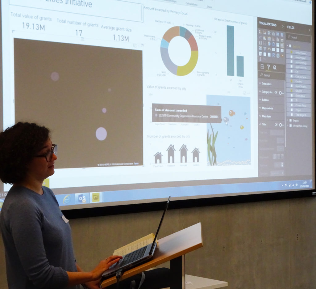
The first tool we will cover is Power BI, a cloud-based business analytics service that gives you a single view of your data. It enables you to create live dashboards, interactive reports, and track your KPIs. It’s a good tool for visualising your data in different ways and you don’t need to be an expert in design to use it.
The cloud based software (Power BI Service) works alongside a desktop-based interface (Power BI Desktop). Reports are build through the Desktop app and shared via the Service, enabling you to view your dashboard and data visualisations on other devices through the mobile app. The reports can be downloaded as PowerPoint presentations.
Power BI is a Microsoft tool and it can integrate easily with Microsoft Excel. It only works on the Windows operating system and has a discounted version for non-profits.
How to get started?
You can sign up/download Power BI here.
There are a variety of online training programmes available:
- Microsoft Learning Resources (guided learning, samples and documentation)
- Analyzing and Visualizing Data with Power BI (course on EdX)
- Blog
- Community (organised by topics, including ideas for custom visuals and for improving Power BI in general that users can vote for)
- RADACAD Data Analysis and BI Blog with a free book: Power BI from Rookie to Rockstar
- Youtube – lots of tutorials available!
Custom Visuals
When creating your Power BI report, you can use different types of visuals. In addition to the standard visuals included in the Desktop app, you can use Custom Visuals created by either Microsoft or developers around the world. They can be downloaded here (n.b. only certified custom visuals can be exported to PowerPoint). Each custom visual comes with a quick video explaining how to build it.
Other Resources
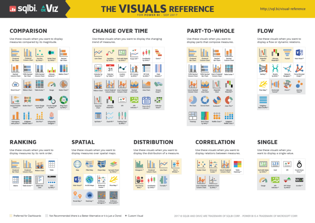
- Power BI Visuals Reference – a neat infographic that shows what types of visualisations you should use depending on what you need to show.
- Batch Gecoding allows you to obtain geographical codes from postcodes (does not include Northern Ireland).
- Color Picker / Paletton helps with choosing the best combinations of colours for your visualisations.
In our next blog we will look at using Carto to visualise data geographically.