Data Visualisation Challenge

Developing and visualising innovative solutions to key questions facing the grantmaking sector

Data Visualisation Challenge

In 2018, 360Giving invited developers, researchers and anyone with an interest in the data to use our dataset to develop and visualise innovative solutions to two key questions facing the grantmaking sector.

The questions, which were selected through the “Quest for Questions Challenge“, were:

  1. Who has funded what themes throughout the years?
  2. User-led organisations: Who funds them, in what thematic area, how much funding do they receive and what type of organisation are they (e.g. CIC, charity, co-operative, community group)?

Challenge winners

The winners of the challenge were announced in September 2018. They were:

All challenge submissions can be found below:

Submissions to the challenge

Top 10 funders in the UK grantmaking sector

By Anait Bojadzjan
What themes have been funded by the top 10 funders since 2010.

The visualisation is showing 12 themes that were funded by 10 largest UK funders in the years 2010-2018. The sectors include health, science, community, social, education and others. Different sectors are represented by different colors and the overall recipient funding in that sector is shown by the bar length. Only recipients and grants above certain limit are included in the analysis as described in the visualisation.

View visualisation
Github

A Drop in the Bucket

By Tom Neill
Who has funded what and when, and what does that look like in bucket-form?

For each keyword-theme, all the funding from all the grant making foundations listed on GrantNav are aggregated each month. The larger the amount awarded, the larger the block that drops onto the screen. Between 2008 and 2018, the bucket should fill up. It’s quite addictive to sit and stare at the blocks bouncing around. Also, if you grab one of the blocks with your mouse, you can smash everything else out of the way. More seriously, it’s quite a nice way to see visually the size of the funding from the different organisations over the years – whether that’s for comparing the foundations involved in each theme, seeing trends/fashions within a theme, or for seeing whether a theme is characterised by a few big months of funding, or if there’s a consistent ‘dribble’. Sometimes some of the blocks fall out, that doesn’t really mean anything, but is fun to watch.

View visualisation
Github

Interrogating 360Giving grant data with R

By Henry Partridge
Visualise 360Giving.org grant data interactively with linked widgets in R

This interactive web app allows users to interrogate 360giving grant data on homelessness, cycling and mental health between 2010 and 2017. Users can filter the data with dropdowns and linked brushing. The app has been designed in R to encourage reproducibility: the source code can be adapted to visualise other themes.

View visualisation
Github

3x3x3

By shi Blank
Making sense of the grantmaking sector by using GrantNav from a civilian’s point of view.

I’m fairly new to the concept of grant making. I am unfamiliar with the way they run, how they are regulated, if at all, where and how funders get funding, who benefits from them – you get the idea. I do know they are a big deal; big money supporting big issues, causes and projects for all levels of people and organisations. This was more a learning exercise than an investigation into a sector that plays a huge role in the everyday of so many individuals, largely behind closed doors. With the 360Giving open standard, this will hopefully no longer be the case. I decided on a process of using GrantNav as a civilian; whittling down my searches using the filters, downloading the CSVs and tallying up the results in Google Sheets. I used Inkscape to create the visualisations – on the plus side, the graphs were not generic but designing took a week to finalise.

View visualisation
Github

Top 10 Cycling Grants Funders

By Anmol Sunsoa
Focusing on High Value Funders

Cycling Grants Data Data Grouped Visualisations reflective of selections and interactive

View visualisation
Github

THE FLOW OF FUNDS

By Sebastian Florian and Thea Christine Hoeeg
Visualisation of user-led organisations supporting children with disabilities, and who funds them.

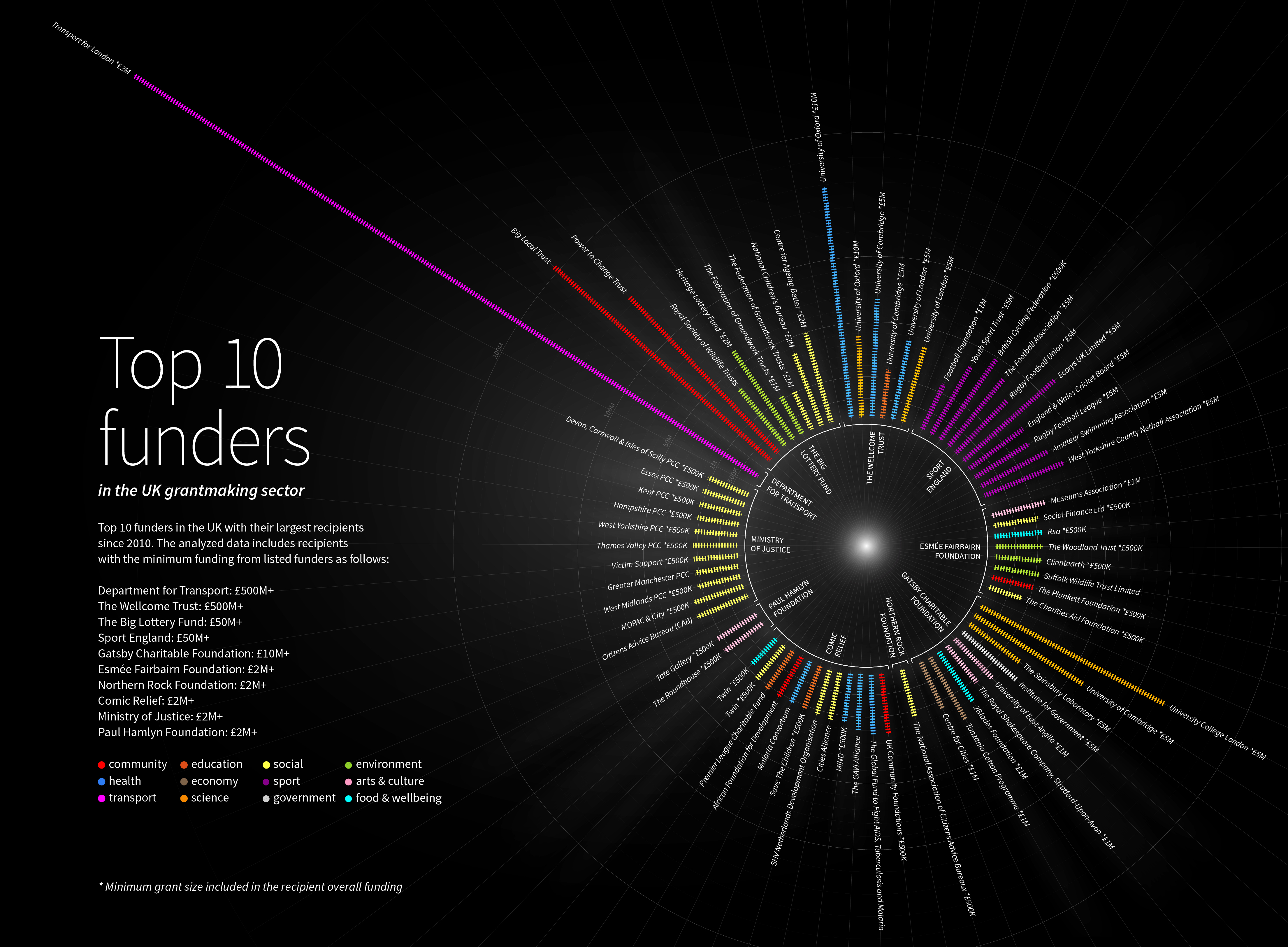
We have chosen the theme ‘children with disabilities or disadvantages’, because we believe in the importance of getting support early on in life in order to be able to give children the best possibilities for the future. The word “disabilities” in this case has a broader definition – ‘A physical or mental condition that limits a person’s movements, senses, or activities.’ (source: https://en.oxforddictionaries.com/definition/disability), in order to include more grants and recipients in the data-set. It has been truly amazing to read about all the great initiatives to help children and young people with disabilities or disadvantages, as well as the many initiatives supporting and guiding their families to help create a better life for everyone. Looking through the data, we filtered out some results that did not fit the theme, but we also kept a lot that had the overall vision to help children either with physical or mental disabilities or with disadvantages, that could impact their physical or mental well-being. We were not strict in regards to filtering, as the overall aim seemed to us to be most important – to improve the lives of all children and give them the best possible start in life. Specifically, we are showing the grants above £1,000, given within the last five years (2014-2018) to user-led organisations that help, educate, train, or in other ways support children with disabilities or disadvantages, and their families. Defining user-led organisation: We have used the data from the 360 GrantNav dataset, filtering for user-led organisations by typing ‘user-led’ in the description field. We have included all types of user-led organisations and used the broader definition of user-led organisations as organisations that are run by service users and “…where there is clear accountability to members and / or service users.” (Quote from Centres for Independent Living / Local user-led organisations: A discussion paper by Jenny Morris, page 3”). This also includes grants given to organisations that have a user-led component, e.g. community-led organisations, or support these as well as parent-led organisations, or similar representatives of support service users. Type of organisation: The types of organisations are based on what is specified within the data. In the cases, where the type was not specified, we were in most cases able to find the type described on the organisation’s website. Since we are not familiar with the different types of organisations, we have not been able to be very critical about the information provided on the websites or in the data-set. Most of the organisations are charities – almost 75%. The rest comprises of community groups, CICs, churches, schools, research institutes, a number of ‘non charitable unincorporated organisations’, and a few other types. The types are each given a color in the visualisation, to make them easy to differentiate, but as almost 75% are charities, this color becomes very dominant in the visualisation. Data visualisation: The idea behind the visualisation was to give a clear overview of the flow of funds from funders to recipients. The visualisation is based on a Sankey diagram, which is a type of flow diagram, in which the lines are shown proportionally to the flow quantity, which in this case is the size of the grant in pounds. The lines ‘flow’ from funders in the top to the recipients at the bottom. The width of the bar for the funders/recipients indicates how much money they have awarded/received in total. From the visualisation it is clear to see that there is two main funders: The Big Lottery Fund and The Wellcome Trust, that fund around half of the total sum given to this cause. These funders give grants to a large number of recipients as well as giving out the largest sums. From the length of the top bar, we can see that The Big Lottery Fund awards almost twice as much money as The Wellcome Trust, as the bar is almost twice as wide. By looking at the width of the lines connecting the funders and recipients, which becomes highlighted once you hover over them in order to differentiate them better, we can clearly see that The Wellcome Trust has given out the largest grant, of 4,077,276.00 £, as it has the widest line. We wanted to make the visualisation interactive, because it makes it more fun and creates some curiosity around what you can discover by hovering over the lines and the bars. We also wanted to make it possible to make simple searches – by choosing a specific funder or recipient in the top right corner, you zoom in on that organisation and get to read about them in the left information box. Furthermore, we wanted to give the opportunity to include or exclude certain years, to see how this changes the visualisation. This gives the possibility to visually show how there has been awarded more/larger grants some years compared to others. The visualisation can also be accessed from a mobile device, but you will only have access to the data and not the diagram. The visualisation is based on data extracted from GrantNav, and has been developed to communicate the specific dataset we chose, but the framework can very easily be used for different datasets, which gives a lot of possibilities to for example add more data, visualise other themes or look at how the flows changes over time by adding data from additional years. Further analysis: Upon reading through the data, we decided to group the grants into different overall categories, depending on what type of cause they were supporting. The categories are based on the description of each grant, and included categories like ‘Support / Guidance’, ‘Community / Social activities’, ‘Training / Exercise’, ‘Culture / Art’, etc. This was not part of the challenge question, but arose from an interest in investigating which types of initiatives get funded and if there are some areas that are better funded than others. Of the 245 grants we looked into, the distribution of types of initiatives funded are as follow: Category / Percentage of grants: Support / Guidance – 33,9 % Community / Social activities – 30,6 % Training / Exercise – 9,8 % Culture / Art – 8,2% Health / Research – 6,1% Education – 5,3% Accessibility – 4,5% Safety – 1,2% Social Justice – 0,4% Even though the categorisation is not accurate, since it is primarily based on our assessment and each grant has only been given one category based on their main focus, whereas some would fit in several of the categories, it indicates some trends in the data. There is a lot of grants going to initiatives focused on ‘Support / Guidance’ in the form of for example support groups, counseling, etc. and ‘Community / Social activities’, for example playgroups, community centers, etc. This does not, however, indicate how much money is given to each category. This data is not included in the visualisation (it is only noted in the description of the recipients), but is an idea for a next step in the analysis that could be integrated in the visualisation in the future.

View visualisation
Github

Blooming Data

By Joe Hall
A beautiful way to visualise which funders are supporting the growth of user-led organisations

When I think of the user-led organisations I know, it feels like a beautiful and powerful thing for funders to be investing in them — planting seeds that grow in important and sometimes surprising, unexpected ways. This is what I wanted to celebrate through my visualisation, using gorgeous time-lapse photography of flowers coming into bloom. Information can be beautiful… why not make it stunningly beautiful? I wanted to mesmerise and captivate hearts as well as minds, inviting people to watch and interact and uncover, with a simple design and interface and plenty of visual space. I also wanted to see if I could breathe new life into the humble pie chart 🙂 In an ideal world I would have taken this further to look at the types of user-led organisations too (charities, CICs, etc) but I hope nonetheless this contributes something important, worthwhile and valuable.

Github

What’s Up?

By Joe Hall
Does funding lead or follow emerging issues? Showing grant giving compared to public popularity

You could argue that the measure of a data visualisation is how much it opens our eyes and our minds to ask new questions. What’s Up? features four issues that have risen up the public agenda in the last decade, comparing and contrasting funding levels with levels of public interest (measured by Google search popularity). These are some of the questions it aims to provoke… Did grant funders lead the way supporting charities and groups working on these issues, before they got big public attention? Did they follow the public? Lag behind? Ignore them completely? Are funders ahead of the curve on emerging issues of public interest? Or are they more conservative? Should funding respond to public opinion at all? Or should funders lead the way in championing unpopular causes? Maybe funders just respond to the applications they get… or maybe funders should be pioneering rather than reacting? What’s Up? is also an attempt to show data in a very different way: a simple, surprising aesthetic designed for a mobile age. Partly tongue-in-cheek using emojis, but with a serious message. Intentionally not beautiful – but hopefully captivating in a different way, even on a small screen. The design and interface reflect the data, playing out like a conversation (or is it a disconnect?) between the nation and funders year by year – that prompts as many questions as it answers…

View visualisation
Github

360Grants – year 2017 Web Data Visualisation by Zoomable Circle Pack

By Petrando Richard Parera
Zoomable Circle Pack

This interactive visualisation aims to answer the first question : ‘Who has funded what themes throughout the years?’. This is known as zoomable circle pack : packs of circles that can be zoomed – by mouse click. The largest circle (with the lightest blu-ish color) represents the entire data, the smaller circle ‘packs’ – with gradually darker blu-ish color – within it represent themes and sub-themes. The smallest circles – bright white – which appeared when a theme or sub-theme circle is hovered by mouse cursor – are all the grants categorized into that theme. Each theme or sub-theme can be zoomed and focused into by click upon it. In case of the white grant circles, a click on it will focus into it’s closest sub-theme parent. Click again at the focused circle to reset the view (or you can reset the view by clicking anywhere on the body of the page) Each and every circles has tooltip with various information, most notably are the grant value and the grant description. The barchart on the right represents all the funding organization and how much money they have granted, sorted descending from largest grant making value to the smallest. And to answer the question ‘which organization has funded what theme’, please use the ‘Select Funding Organization’ available on top. (NOTE : i was originally planned to use at least two years of data – 2016 & 2017 – but there is not enought time, so only one most recent year : 2017)

View visualisation
Github

Slice & Dice

By Suraj Vadgama
A tool to explore GrantNav searches visually

This tool was created in my spare time as a submission to the 360Giving Data Visualisation Challenge, in answer to the question “Who has funded what themes throughout the years”. It allows you to take the URL of a search on GrantNav (http://grantnav.threesixtygiving.org), and visually slice it up by dimensions such as Year or Location. A brief tour guides you through a series of ‘slices’ that show how the tool can be used to explore a range of topical funding themes; ending in a version you can use to create your own visualisations to share. In particular I wanted to create something that would, compliment existing tools that make use of data in the 360giving format (namely GrantNav); and hopefully be used by funders and fund seekers after the data visualisation competition.

View visualisation
Github

360giving Grantmaking themes

By Xavi Giménez
A Topic Modelling analysis and Data Visualization of the grantmaking sector

360Giving has launched a visualization challenge to answer questions to help funders to maximize their impact on the charitable causes they support. Such questions intend to give a better understanding of the grantmaking sector. Here we look at one specific question, which tackles thematic trends: Thematic trends: Who has funded what over the years? That question is open in the sense of what a theme is, since there isn’t a standard categorization in the grantmaking sector. Despite the richness provided by the 360giving dataset regarding grantmaking sector, there is not a direct categorization of to what theme a grant belongs. Discovering themes from the data itself: The 360giving dataset gives a fairly detailed information of a grant through several fields within the dataset, offering information about the grant, the funding organization, the recipient, dates, amount awarded, etc… The fields describing each grant provides a large corpus of text documents regarding endowments, therefore some Natural Language Processing techniques can be applied in order to automatically discover the hidden thematic structure in our corpus of grant document. More specifically, Topic Modelling has been applied in order to discover our themes from the collection of grants. With this text mining approach, given a corpus of unstructured text documents (e.g. news articles, tweets, etc) and without a prior annotation, Topic Modelling outputs a set of topics, each of which is represented by a set of top-ranked terms for the topic and associations for documents relative to the topic. In our case, here the text documents are the text fields that describe each grant (title and description). From that textual information, themes will emerge as well as the relativeness of the grants to each theme.

View visualisation
Github

Funding Trends

By Oliver Carrington and João Silva
An interactive web app presenting key funding trends and a dedicated dashboard for each funder

Funding Trends is an interactive web app visualising data from 360Giving and the Charity Commission to present key funding trends and a dedicated dashboard for over 70 funders. It aims to be simple and easy to understand. It uses a variety of graphics to answer the two 360Giving challenge questions—including bubbles, bar graphs, infographics and heat maps. For the funding overview, users can filter by year to see the top funders and recipients; categorise funders by the type of grants they give; and view how much is spent on recipients working in different themes. For the dashboard, users can select a funder to explore in more detail—making comparisons across different years and other funders. They can view the funder’s ranking in terms of grant giving; see the funder’s top recipients; and find out the most common themes of its grant recipients. See full presentation and rational of the tool here – https://docs.google.com/presentation/d/1jCtgEpQWtjRSDUzspDUsv3YyXkNPGolNL_Nq45vrQOI/edit#slide=id.g3e0ed2379d_0_29

View visualisation
Github

Identifying Trends by using Keywords(Themes) based filtering methodology.

By Akshay Verma
Filter across 1800+ themes(keywords) to find trends all different funding organization.

The projects aim to showcase the trends for 1800+ keywords for different years for all the funding organizations(in the dataset). The visualization gives a high-level view of how the organization has been funding different causes. The visualization provides provision to filter data points based on keywords and provides tooltip to further explore other details. The funding organizations are further ranked on the basis of their cumulative funding across the years.

View visualisation
Github

Funding patterns in the UK Grantmaking sector

By Ryan Nazareth
Visualising the pattern of organisation funding between 2008 and 2017 for sports, elderly and science themes.

DATA COLLECTION AND CLEANING The data was acquired from the Grant Nav database filtered from years 2008-2017. The data was subsequently cleaned using a custom script in R programming language to remove unnecessary columns (like additional redundant location info) and adapting formats of date and location information e.g. removing ‘North East’ in ‘North East Lincolnshire’ or removing other stopwords like ‘City of’ , ‘City’, ‘County’ in the location name to make it easier to filter and plot on a map. More information can be found in the source code (https://github.com/ryankarlos/GrantNav_Challenge1). The data was then filtered into themes according to keywords (note that initially a range of themes were tested to see how much data was included in each – only three of these were chosen below): a) ‘elderly’, ‘older people’, ‘dementia’ would suggest the theme is elderly b) projects with ‘sports’, ‘fitness’ for sports theme c) projects with ‘science’ for science theme Another column was added to identify if the location was based in London or not (yes or no). This would be used for filtering a London only map in the visualisation. The major challenge was to manually fill in location data for recipient organisations which did not have any location info on Grant Nav (a large proportion of these were universities). For this, a combination of websites were used to check the organisation locations like Find that Charity [1], Charity Base [2] and the Charity Commission [3]. VISUALISATION The interactive dashboard created in Tableau allows the user to filter the year, funding organisation and amount funded. By default the minimum grant award has been set as £300,000 as it allows easier inspection of the visualisations but this can be adapted by changing the lower range number in the select box. The treemap on the left shows the recipient organisations receiving the most funding based on the size of the squares and the colour corresponds to the funder. The spatial map of UK on the right shows the locations of the recipient organisations and amount funded (encoded by size and colour of the circles) across the UK. Note that the data also included recipients in locations outside (and close to) the UK such as Ireland but these are not reflected in the map as it was tricky integrating foreign locations along with the UK geocoding in Tableau. Since the location info in London is quite clustered to visualise in the UK map alone, I thought it would be useful to include a map of London boroughs to allow visualisation of where the recipients are located within London (here the amount of funding is colour coded – lighter the colour, the more the funding). The stacked line chart on the bottom left shows how the trend in funding varies across the time period for the different themes. The width of each of the theme colours at any point is the funding received for that point in time. Each of the charts can be hovered over to get more information about funders and recipient organisations etc. Additionally, selecting a section of each chart filters the entire dashboard e.g. a square on the treemap corresponding to a single recipient, a single theme (colour) on the stacked line chart etc. RESULTS The results show that the elderly and sports themed projects receive the most grants (over 6000) whilst the sports themed projects received the most funding of around £625M (with less than a third of as many grants as the other two themes). The Big Lottery Fund and Wellcome Trust account for majority of the funding across all themes as seen in the treemap, with the Gatsby Charitable foundation and Lloyds Register Foundation also making large donations above £3M. It’s interesting to note that the Big Lottery fund contribute more smaller grants (large number of smaller brown squares), whilst the Wellcome Trust contribute relatively fewer grants but the value of each of the grants is much larger (larger blue squares). Science Theme The top recipients seem to be around the London, Oxford and Cambridge region which is home to a number of these universities like UCL, Kings College London, Imperial College London, London School of Tropical Medicine and Hygiene, University of Oxford, University of Cambridge. Up north, Liverpool gets the most funding (home to the Liverpool School of Tropical Medicine) followed by Manchester, parts of Yorkshire(Sheffield, York, Leeds) and Newcastle. Unsuprisingly, the Wellcome Trust which is a major research charity funds most of these university and research institute projects. £625M went into funding science research during this period. The line chart shows prominent peaks around April 2015 (£47.7M), October 2016 (£51.1M), Sep 2010 (£32.6M), April 2013 (£26M). We can see peaks at regular intervals with periods of little funding in between – which reflects the fixed term nature and specific timing of commencement of research projects. Elderly Theme Here we find the demographics a lot more clustered than the science theme with the Midlands, North West, South West and Northern Ireland regions receiving the most grants. Within London, Camden, Westminster, Islington and Kensington boroughs received the most funding. Around £371M went into elderly themed projects during this period with a total of over 6600 grants funded. Again Welcome Trust contributed a larger chunk of the donations (mainly between £2M to £15M) during this period predominantly to universities. The Big Lotter Fund contributed a large number of smaller donations (between £300000 to £2M) to old age related charitable organisations with notable donations between £4M – £10M to Alzheimer’s society, Social Finance Limited and The Silver Line Helpline. The line chart shows prominent peaks around March 2011 (> £15M), April 2012 (£14.5M) and August 2013 (£12.3M). It seems the period between 2011 and 2014 was particularly strong in terms of funding (compared to 2008 – 2011) followed by a dip between September 2014 and March 2015. Funding in this theme is more distributed over time compared to the science theme which has peaks at intervals. Sports Theme £159M worth grants were funded during the period between 2008 to 2017, with the top contributors Wellcome Trust and the Big Lottery Fund funding mainly universities and charities/communities respectively. Sport England funded a project worth over £1.1M at the Redbridge Sports Centre and the Power to Change made smaller contributions just over £300000 to a Community Trust and Association. The demographics are more clustered around the Midlands, North West, Yorshire region, Cambridge and South East. Liverpool, Birmingham, Cambridge and Leeds received the most funding (over £3M). Within London, the funding was more distributed across the central part (compared to the other themes) with Camden, Tower Hamlets and Southwark boroughs receiving the most funding (over £1.7M each), and other recipients in South (Bromley, Croydon) and East London (Barking) also benefiting from grants The line chart shows a strong period of funding between Jan 2009 to October 2009 and Nov 2015 – July 2016 with over £3M worth grants being funded during this period. Licensing As required as part of this challenge, this work is licensed under a Creative Commons Attribution 4.0 International License (included in the footer of the dashboard). Resources 1) Find that charity http://apps.charitycommission.gov.uk/showcharity/registerofcharities/RegisterHomePage.aspx 2) Charity Base https://charitybase.uk/ 3) Charity Commission Register of Charities http://apps.charitycommission.gov.uk/showcharity/registerofcharities/RegisterHomePage.aspx

View visualisation
Github

Explore the themes the top funders funded through the years

By Julien Assouline
Application for exploring the themes funded by top grant funders.

With this application you can select a theme, then click play to see the data animate and tell a story. You can also Drag the slider to explore the data further.

View visualisation
Github

A Forest of Funders

By Cath Sleeman
Exploring the landscape of UK grant funders through a handmade data visualisation

This data visualisation consists of handmade paper trees. There are 20 trees, one for each of the 20 largest funders. The features of a tree, such as the lengths of its branches and its height, reflect key characteristics of the funder, including the value of grants they have awarded and the themes that they have funded. These handmade trees are an example of a physical data visualisation, where data values are encoded in the attributes of an object. This form of visualisation allows data insights to be communicated in a creative and accessible way.

View visualisation

360Giving Trend Engine

By Dan McCarey
A dynamic dashboard application for trend discovery

GOAL The 360Giving Trend Engine application allows users to quickly explore who has funded which themes over time and track the scale and location of grants. PROCESS As theme information per grant was inconsistent and patchy, a theme assignment algorithm was written to assign themes based on grant descriptions. With the themes populated, the data was aggregated by theme for each funder providing award and project counts at yearly intervals. Grant locations were joined using the geoid and then converted to geojson and vector tiles. STACK The data aggregation and theme assignment algorithm were done using Node.js. The application is built on React and Mapbox GL. Maptian is a data visualization and mapping studio based in Silver Spring, MD.

View visualisation
Github

From funder to user

By Victòria Oliveres
Data visualisation in D3.js of grants to user-led organizations

As a data journalist, I created a long-form with a series of data visualisations to map the grants to user-led organisations. The basic idea is to assign each grant to a square figure and color, size and order them in different ways to visualise themes, amounts awarded, organization types and funders. First, I used R programming language to clean the data, detect grants related to user-led programmes and analyse them. The code for the analysis can be found in this Github repository: https://github.com/vicoliveres/user-led-grants/blob/master/User-led%20grants.Rmd For this analysis, I have taken into account communities and residents, patients, young people, older people, volunteers, children, parents and families, women, disabled people, students, BAME people, asylum seekers, violence survivors and ex-offenders. These are different groups considered likely to set up user-led organizations with activities, services and programmes planned by and used by themselves. Another big part of the analysis was categorising the grants in themes and the assigning a type for each organization. As this information is not provided as a variable in the dataset, I used text-analysis techniques. When the data was ready in a JSON file, the different charts were created using the javascript library D3.js and CSS Flexbox. This language allows custom and responsive visualisations. I have also included tooltips to allow the viewer to find out more about each grant, represented by a square or rectangle. The full code for the page is available in this Github repository: https://github.com/vicoliveres/user-led-grants/tree/master/docs For a better experience, open the page in Firefox.

View visualisation
Github

International Grants

By Naledi Hollbruegge
How are UK funders giving to international causes?

A very small proportion of grants by UK funders, just over 1%, is given to recipients with beneficiaries in other countries. As a UK charity working in Africa and Asia, Operation Fistula wanted to have a closer look at the characteristics of these international grants. The majority of international grants that were identifiable in the dataset were awarded to recipients with beneficiaries in Africa. A surprisingly large amount (31%) had been given to the US, with non-UK European countries making up the remaining 2%. There was only a small number of funding organisations responsible for these grants, with the majority being driven by just two funders. A qualitative analysis of the grant descriptions identified eight broad themes to classify these grants. Furthermore, we realised that a large proportion of the grants had been awarded to projects that were aiming to use technology and data to address societal issues. Operation Fistula has a particular interest in this aspect, as we aim to do exactly that, by collecting electronic patient data to learn more about maternal health, and in particular obstetric fistula, in developing countries. We categorised the grants into those with or without an explicit technology focus. This shows us that technology is widely used to address most of the themes, but is missing from the Agriculture & Forestry category. We can also see that the largest grants were given to projects without an explicit technology focus. The visualisation guides the viewer through this analytical journey, but also allows further exploration by interacting with different charts that can filter the rest of the view.

View visualisation

User-led trough time

By Natalija Jovanovic
Last 20 years of user led funders, recipients and projects

This visualization answers how many user-led projects, grant receivers and funders were in UK in the last 20 years.

View visualisation
GrantNav search

NLP theme explorer

By Aleksi Knuutila
Finding distinctive themes by applying natural language processing to the rich language of grant descriptions

This visualisation answers the question “Who has funded what themes throughout the years?” Visualisations often rely on pre-defined categories. Instead, this visualisation uses natural language processing and machine learning to find themes in the language funders use to describe their grants. This visualisation displays distinctive phrases for every year. Distinctive phrases are the ones that are frequent in a particular year but not frequent across the entire dataset. The most distinctive phrases are displayed with darker text. The larger a word is the more money was available for grants associated with the theme. The funders that are most prevalent in the data, the Wellcome Trust and Big Lottery Fund, are distinguished by colour.

View visualisation
Github

Grantmaking: The who, what when and where

By Dylan Omran
An interactive exploration of the Grantnav database

I chose to answer question 1. Like so many data visualisation challenges the hardest part was handling the data. Having decided to tackle the whole database (at least for years 2004 to 2017 – the other years didn’t seem to have much going on) I needed a way to handle a lot of data. I experimented with various solutions. Graph databases, Tableau, PowerBI, D3 and so on. I finally decided to aggregate the data and use a combination of Flourish and Observable. Flourish’s Survey template was the best solution I could find to the challenge of bringing the different elements into one visualisation, in a way that made sense, had visual appeal and – importantly – was easy to use. Using only simple dropdowns the viewer can ‘play’ with the data and watch the changes happen. And I wanted to show other non-developers out there that we have some amazing visualisation capabilities within our reach. Deploying through Observable felt in keeping with the spirit of sharing this work. My entry is open to all. Anyone can add their own visuals or edit the commentary and save their changes to make a new version. Thank you to 360Giving for giving the data visualisation community such an interesting challenge.

View visualisation
Github

Theme Explorer

By Alex Brothers
A tool built in Tableau that answers the question: ‘Who has funded what themes throughout the years?’

This tool uses the 360 Giving grant dataset (excel extract) in order to answer the question of which funding organisations have funded what themes throughout the years. This is explored through four simple charts which make up the dashboard: 1) Amount awarded for each ‘Theme’ (with ability to filter by year awarded) 2) The top 3 organisations funding each theme over the last five years 3) Across all years, the top 10 organisations funding a theme 4) The title of each grant awarded along with the organisation who funding it, based on the selected theme. (Charts 2-4 can be filtered based on the theme filter) The aim of this tool is to quickly and succinctly answer the question above, without losing the user in overly complex visualisations. Additional notes: The greatest amount of time went into categorising the data into each ‘theme’. These were decided by reference established themes used in the grant making sector, and were refined through inspection of the amount of grants attributed to each. About 3.5% of the grant amounts awarded were unable to be set to a theme, but these are present to explore by selecting the theme filter option ‘Theme not defined’. Note: In order to get the best user experience, please view this visualisation in full screen after opening the link to the Tableau public workbook.

View visualisation

theme2d

By Tim Lawson
Finding a 2-d notion of theme with techniques from NLP and ML

I chose to answer the question ‘Who has funded what themes throughout the years?’. On reading it I was struck by the word ‘theme’. After exploring the data in GrantNav, I wondered whether techniques from Natural Language Processing and Machine Learning could evince a notion of theme from the text associated with each grant. In brief, I obtained a 2-d vector corresponding to each grant by taking a weighted average of vector representations of its words and reducing each vector in this set to two dimensions so that they could be visualised in the browser. The aim therefore is that the position of each circle encodes its ‘theme’; the area in each case corresponds to the amount awarded (GBP). The circles are coloured according to the funding organisation. To obtain a vector corresponding to each grant I took the average of pre-trained word vectors for the title, description and recipient organisation of each grant, weighted by the inverse document frequency (IDF) of that word among grants of the same funding organisation. I chose this weighting to suppress the influence of funding organisation on the clustering of the grants; for certain organisations the same words or phrases appeared frequently. To reduce the number of dimensions of this set of vectors from 300 to 2, I applied truncated singular value decomposition (SVD) and t-distributed Stochastic Neighbour Embedding (t-SNE). Because many of the circles overlap (due to the large variation in the order of magnitude of the amount awarded) I decided to ‘collide’ the circles in D3.js; effectively each circle is tethered to its position. The data I chose to display in the final visualisation comprises grants of at least £1m awarded between 2004 and 2017; however, the vectors were calculated using the full GrantNav data set. (Be warned: on my laptop this took many hours!) This restriction improves the load time and real-time performance of the visualisation, both of which are lacking. The question, of course, is whether this representation is meaningful or useful. This is to say, do the relationships between the grants in 2-d space correspond to our intuition? Medical topics occupy the northernmost area of the page and appear better-separated than other grants – I expect this is because of the precise vocabulary and often detailed descriptions. This approach is less successful with terse or boilerplate text, such as ‘towards core costs’. This is very much the start of an investigation, and in future I hope to apply these techniques in other ways, e.g. performing classification tasks by evaluating the nearest neighbours of an unknown datapoint. I would encourage you to explore the landscape for yourself and see what semantic relationships you can find.

View visualisation
Github

PowerBI 360 Giving Challenge – Rishi Sapra

By Rishi Sapra
An interactive data visualisation produced using Microsoft Power BI

For a run through of the key content in the report please see https://youtu.be/8VhKhjp4hQo

View visualisation
Github

Grant Funding and Deprivation – Lava Lamp Style

By Jamie Whyte
Visualising the distribution of grants awarded by relative deprivation of the recipient

I wanted to see how the funding profile of different funders varied, using the index of multiple deprivation as a reference point. To do this, I used lava lamp plots to compare the distribution of grants. These are essentially violin plots, created in R using ggplot. If the plot has a fatter bottom, then the funder gives more grants to recipients in more deprived areas. If the plot has a fatter head, then the funder gives more grants to recipients in less deprived areas. A broadly rectangular shape indicates even distribution of grants across all deprivation vigintiles. To calculate this, I downloaded a dump of all data from GrantNav (~250,000 grants), and filtered out all grants for whom the recipient postcode field was empty. This left me with around 63,000 grants. I then removed any invalid postcodes (non-England, partial, etc) which left me with 53,000 grants, and then mapped these firstly to lower layer super output area, and then to deprivation data. This dataset then allowed me to draw the plots. I genuinely feel this is a novel and useful way to look at data like this – you immediately get a sense of the overall picture of grant funding, through the lens of deprivation, and allows people to ask questions of, for example, Lloyd’s Register Foundation. I think there’s more work to be done here, and I’d love to have looked into it further (indeed I might carry on). There are a few issues that I need to resolve: * The shapes look at number of grants, not amount * This particular visualisation could probably do with a bit more design * My horrorshow code needs sorting out * I’m not sure whether recipient is the best measure to use. Beneficiary would probably tell a more compelling story but the data just isn’t there in the same detail There’s some other stuff that’s out of my hands – the fact that almost 200,000 grants were missing postcode. Imagine if we could do this for all grantmakers, and include all grants. Thanks for looking, and sorry it’s so rushed!

View visualisation
Github

AN EXCEL VISUALISATION

By Kwasi Amankwah Awuah and Jamila Farouk Jawula
A quick excel visualisation answering Question 1 of the 360giving dataset challenge

This is a visualisation of organisations and the sum of amounts they have donated to charities of different themes from year 2006 to 2018. This visualisation was made in excel using the 360giving dataset combined with data sets from the UK Charity Commission website.

View visualisation
Dataset

Is the Money Going Where it is Most Needed?

By Yan Naung Oak
Comparing Grantmaking to English Indices of Deprivation

The Index of Multiple Deprivation tracks various local administration districts across 7 different themes: -Income -Employment -Education, Skills and Training -Health Deprivation and Disability -Crime -Barriers to Housing and Services -Living Environment Based on these 7 themes, districts across the UK are given scores. Each of the countries in the UK have a different scoring system and so cross-country comparisons cannot be made, for instance between a district in Scotland and a district in England. Because of that, we choose to only look at districts in England. Breaking down the GrantNav data in the 7 themes Using keyword seraches in the Title and Description fields on each of the 200,000+ grants on GrantNav, we can match the grant funding that is award to each theme. We then break the total amount awarded for each theme for each district in England. What do we find? We visualise the data using an interactive map and scatterplot. Ideally, the scatterplot should show a positive correlation between the amount of deprivation for each district and the total amount of grant funding awarded. In most categories, there is a positive relation, but in the themes of “Education, Skills and Training” and “Barriers to Housing and Services”, we can see that some of the disticts with higher levels of deprivation are not getting higher levels of funding then the less deprived districts.

View visualisation
Github

Grants to Charities

By Dan Kwiatkowski
An interactive web app combining two open datasets: GrantNav and CharityBase

For this challenge I decided to focus on the 80,000 open grants made to currently registered charities in England & Wales. The purpose was to present an overview of the grants as well as the organisations they are made to, and to provide an easy way to filter the data e.g. by search terms, funders, dates etc. In an effort to categorise the grants by theme I applied topic modelling on the grant descriptions to pick out 20 common themes and classify the grants accordingly. This technique is a form of unsupervised machine learning; rather than having to explicitly define topics, they are generated automatically from clusters of words which commonly co-occur.

View visualisation
Github

User Led Organisations: Networks and Links

By Ryan Nazareth
Visualising linkages between user led organisations and funders

Following on from my first submission, this visualisation aims to answer the second challenge question regarding user-led organisations DATA COLLECTION AND CLEANING The data was acquired from the Grant Nav database filtered from years 2008-2017, with user-led organisations filtered out using the ‘user-led’ search term. The data was subsequently cleaned using a custom script in R programming language to remove unnecessary columns (like additional redundant location info) and adapting formats of date The data was then filtered into themes according to keywords (note that initially a range of themes were tested to see how much data was included in each – four theme were chosen a) ‘elderly’, ‘older people’, ‘dementia’ would suggest the theme is elderly b) projects with ‘sports’, ‘fitness’ for sports theme c) projects with ‘science’ for science theme d) projects with ‘environment’ for environment theme The major challenge was to manually fill in location data for recipient organisations which did not have any location info on Grant Nav (a large proportion of these were universities). For this, a combination of websites were used to check the organisation locations like Find that Charity, Charity Base and the Charity Commission. The visualisation was built in D3js. I decided to display the data using a Sankey diagram and force directed network graph, both of which are good for viewing flow of information from funders to user led organisations as well as visualising how densely connected organisations are. For the Sankey diagram, I have only included funders who have donated at least £10000 and above to allow the visualisation to be deciphered easily. The force directed graph however does not have any such restriction and includes information about all funders and user led organisations for the specific year and theme. The liquid gauges indicate the number of each type of organisation in the whole dataset. There are a few components in the visualisation which may not work due to lack of time in building this but is still very addictive !

View visualisation
Github

Mapping of Lloyds Bank Foundation Grants

By Dan Cookson
Using latest animated mapping to show grants in relation to a deprivation index map for England.

Highlighting the power of latest mapping technologies to allow audiences to explore open grant data in relation to deprivation data and see how well targeted the grant giving process can be. The theme of grants towards children centered organisations is explored in a second version of map

View visualisation
Github

Visualizing grants awarded from UK to overseas regions

By andres Snitcofsky
Analyzing all the grants that are not being used in UK land.

When 360 Giving GrantNav opened its huge datasets about UK Grant data, I asked myself “what can I understand about things that happen so far away from my region (south américa)?” In the next few dataviz analysis I´ll try to dig into the only thing I can add: a southern point of view. I´m more familiar with the overseas grantees point of view, so I´ll focus my experiments in that particular group.

View visualisation
Github

What and where do funding organisations fund?

By Abi Broad
Dashboards that explore what grants funding organisations have awarded between 2008 and 2017.

Interactive dashboards look at the most common themes and funding organisations between 2008 and 2017. Users can select years, themes and funding organisations to explore the proportions of funding. You can also compare funding organisations and look at where funding is going.

View visualisation

Broadband speed in Germany

By Natalie Sablowski, Patrick Rösing
How official data lies

The project compares official speed data and unofficial data of the organization MLab. Digitalisation in Germany is progressing slowly. Internet speed is an important factor for implementation.

View visualisation
Github