
Understanding historic grants through consistent comparison
An important part of funding is understanding the impact those grants are having. However this is difficult when there are inconsistencies with how data is collected, managed and analysed.
Below, Dr Emma Horrigan – City Bridge Trust’s Data Analyst and recent 360Giving Data Champion – shares how she compares their past and present performance consistently, so as to understand the impact of the Trust’s grants. Her methodology focuses particularly on grants going to disadvantaged groups and is inspired by a previous 360Giving blog by Mor Rubinstien on analysis of LGBTQI+ grants.
The problem
As a funder we are one step removed from those we are ultimately supporting. We know about the projects we fund with charities across London, but we rarely get to know the end users of those services. That already provides a challenge when it comes to showing what impact we have had on the city and its inhabitants, before we can even think about how we make sure we are funding as equitably as we’d like.
Plus, over time we have changed what we ask our applicants, and how we ask those questions – sometimes we’ve not asked those questions at all due to a lack of resources.
The inconsistent data collection methods make understanding the data extra complicated. Add to that the fact that we have not retained consistent options for these data categories, and it can start to feel like not just one tangled ball of string to unravel but a ball made of lots of different pieces.
To tackle the problem, it’s time to start reviewing all our historical data with a consistent approach that we can commit to using in the future. This will allow us to compare what we are doing now with our past performance, and help us to understand the impact of our grants.
Looking at the data
City Bridge Trust has electronic records that date back to 2009. Table 1 demonstrates how much of that data is complete. It’s worth noting that we didn’t aim to add this data in many cases, but for ongoing standardisation it’s imperative we treat all our old data the same.
Table 1: Percentage of available data broken down by data type and grant programme
| Grant Programme | Total grants | Number of grants specifying project type eg. education, or culture and recreation. | Number of grants specifying beneficiary type e.g. older people or migrants | Number of grants specifying organisation type e.g. homeless org or community group |
| Current Grant Programmes | ||||
| Bridging Divides | 733 | 28 (4%) | 163 (22%) | 23 (3%) |
| Small Grants – Bridging Divides | 56 | 5 (9%) | 15 (27%) | 4 (7%) |
| Historic Grant Programmes | ||||
| Anniversary employability programme | 13 | 10 (77%) | 11 (85%) | 9 (69%) |
| Anniversary infrastructure support programme | 61 | 17 (28%) | 45 (74%) | 19 (31%) |
| Investing in Londoners | 1511 | 696 (46%) | 789 (52%) | 649 (43%) |
| Investing in Londoners – partnership programme | 63 | 4 (6%) | 9 (14%) | 3 (5%) |
| Stepping Stones* | 253 | 0 (0%) | 85 (34%) | 0 (0%) |
| Strategic Initiatives* | 241 | 61 (25%) | 81 (34%) | 39 (16%) |
| Working with Londoners | 2346 | 2238 (95%) | 2246 (96%) | 2182 (93%) |
| Youth Offer* | 31 | 6 (19%) | 0 (0%) | 0 (0%) |
*Denotes grant programmes that did not plan to collect this data at all
As can be seen from the percentages in Table 1, it’s a patchy picture at best. In fact, it partly reflects that we realised our data was not consistent or useful and so stopped asking particular questions at the application stage, or asking staff to code during grant assessments until we had agreed a new data standard. In the meantime, we continue to collect the text-rich fields of grant title, grant description, what the funded organisation aims to do, and what the planned outcomes are. These fields will form the basis of the data for re-coding.
Testing the methodology on one dataset
Our current programmes are missing more than 90% of project type and beneficiary type data, and more than 70% of organisation type data. Therefore, I have focussed the remainder of this analysis on our main ‘Bridging Divides’ programme which has 733 grants. This is to test the methodology and to provide firm evidence for internal decision making in the first instance. Once the methodology has been thoroughly tested and checked, it can be expanded to the legacy programmes.
Analysing key words with a focus on disadvantaged groups
To that end, I have been using a variation of Mor Rubenstein’s key word analysis – which she describes in 360Giving’s blog, Analysing grants for LGBTQI organisations – to investigate our grants and beneficiaries. I’ve focused on groups experiencing disadvantages and marginalisation. I have applied this analysis to the grant description and the grant title fields, as in Mor’s works, and I have also included the activities and the outcomes from the application form. Unlike Mor, I did not search the programme area because none of our programme areas contain any useful data for this analysis.
I tested a wide range of related and tangential key words to search for, visually inspecting the results and iterating through to the final terms, as shown in Table 2. The key words shown in the table were for the purpose of testing the methodology. Therefore, it is not a fully comprehensive list and there are some key words missing that will be included in the final version of the methodology.
Table 2: Relevant key words for testing methodology
| Beneficiary | Key words |
| BAME groups | BAME, black, ethnic, minority |
| LGBTQ+ | LGBT*, gay, lesbian, homosexual, queer, transgender, intersex, b*sexual |
| Groups with health issues | Mental, health |
| Migrants | Migrant, refugee |
| Living in poverty | Poverty, deprivation, soci*economic |
| Older people | Older, elderly |
| Youth education | Youth, education |
| Children & young people | Child*, young |
| Disabled people | Disab*, impaired, deaf, blind |
* Indicates a wildcard, used to broaden the scope of the results e.g. b*sexual will find bisexual and bi-sexual
Re-categorising the data
Using these key words, I then re-categorised our Bridging Divides spend data accordingly. Note that this project and these results remain preliminary, pending final design of both the categories and the final checks on the validity of results that will follow this.
Figure 1: Percentage of spend by group, Bridging Divides 2018 – 2020
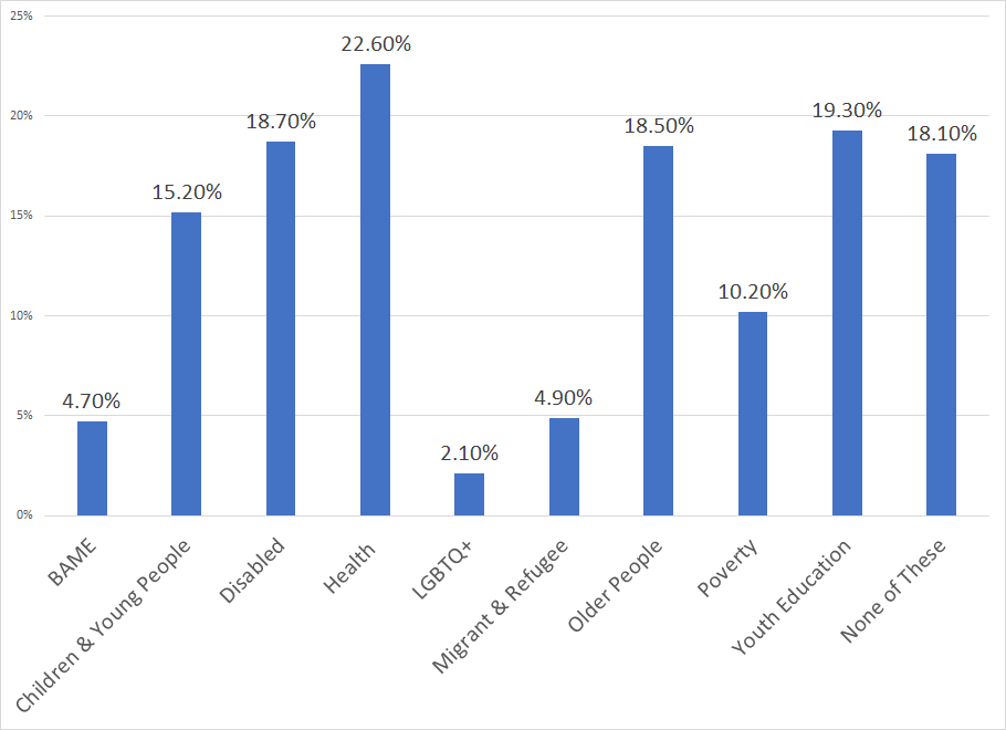
Note percentage totals do not sum to one because grants can fit into more than one category.
There is one final piece in the puzzle before this data can be finalised, which is to collect and agree the list of codes that will be used. This is particularly important for proper categorisation of all minority groups. We are seeking to standardise our codes as well, so that when we publish this data in the 360Giving Data Standard for future grants, it will be comparable with others.
Using coding to communicate project impact easily
Once finalised, the process outlined in this blog will be a robust method that we can expand to all our historical grant programmes.
However, it raises the question – why are we coding if we can extract this data from our application forms? Well, this is an intensive process that can only be done currently by the data analyst, making this data inaccessible to other team members without an intermediary. Also, the code will show on all grant records and allow everyone to see at a glance what the project impact should be. This will be of great benefit to City Bridge Trust as it will enhance our awareness of what we are funding, and inform our internal discussions that shape our strategy and funding direction.
City Bridge Trust is a London-based funder who aims to reduce inequality and grow stronger, more resilient and thriving communities for a London that serves everyone. The Trust’s grants data can be explored using the 360Giving tools.
The Trust is part of the group piloting the new DEI Data Standard – an extension to the 360Giving Data Standard to help funders understand the equity of their grantmaking. The DEI Data Standard was produced by 360Giving and The Social Investment Consultancy with the DEI Data Group. Read more about this project in our blog.
Dr Emma Horrigan, blog author, is a Data Analyst at City Bridge Trust, and a 360Giving Data Champions alumni – our programme that brings funders together to learn how to grow a data culture in their organisations. Read more about the Trust’s equity data in Emma’s previous blog.